Advanced Typography - Exercise

Advanced Typography - Exercise
26/28/2020 - Week 14
Hong Ze Yee / 0335678
Bachelor of Design in Creative Multimedia
Task 1 : Exercise
Exercise : Typographic Systems
26/28/2020 - Week 14
Hong Ze Yee / 0335678
Bachelor of Design in Creative Multimedia
Task 1 : Exercise
Exercise : Typographic Systems
INSTRUCTION
LECTURES
Lecture 1 : Introduction to the module
Week 1 | 26/08/2020
Today is the briefing of the module through Facebook Live session and Zoom meeting. We are to create two artworks of each of the Typographic system.
The 8 Typographic System :
1. Axial System - All elements are organized either to the left or the right of a single axis.

Fig 1.1, Axial System
2. Radial System - All elements extend from a point of focus.
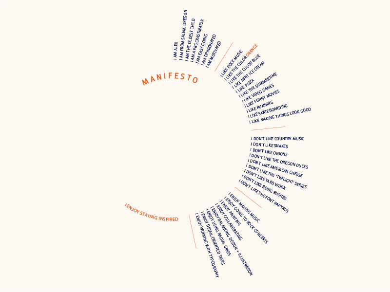
Fig 1.2, Radial System
3. Dilational System - All elements expand from a central point in a circular fashion.

Fig 1.3, Dilational System

Fig 1.4, Random System

Fig 1.5, Grid System
6. Transitional System - A informal system of layered banding

Fig 1.6, Transitional System

Fig 1.7, Bilateral System

Fig 1.8, Modular System
EXERCISES
Exercise 1 : Typographic System
Week 1 | 26/08/2020

Fig 1.1, axial system

Fig 1.2, radial system

Fig 1.3 dilatational system

Fig 1.4, random system

Fig 1.5, grid system

Fig 1.6, modular system
Fig 1.7, transitional system

Fig 1.8, bilateral system
Fig 1.9, PDF version
Exercise 2 : Type & Play Part 1
Week 2 | 02/09/2020

fig 1.1, gear

fig 1.2, traced outline

fig 1.3, letter X, S, R, O, D

fig 1.4, dissected letters

fig 1.5, dissected letters

fig 1.6, first outcome
After I got the feedback, I do some changes of the edge of the letters and decrease the size of it to enhance the characteristics of "gear".

fig 1.7, second outcome
fig 1.8, pdf version
Exercise Part 2 : Type & Image Part 2
Week 3 | 09/09/2020
This exercise is about combine types and images. The text must be
woven into a symbiotic relationship with the image.

Fig 1.1, original picture

Fig 1.2, original picture

Fig 1.3, first attempt

Fig 1.4, second attempt
Fig 1.5, final outcome
FEEDBACK
Week 1 | 26/08/2020
General feedback : No feedback is given
Specific feedback : No feedback is given
Week 2 | 02/09/2020
General feedback : must complete the work
Specific feedback : The grid system does not related to the require system. The Axial system has hierarchy but just have to make some changes of the placing of the words.
Week 3 | 09/09/2020
General feedback : the word must reflect its origins. Besides that, every dissected words' stroke must be consistent.
Specific feedback : The stroke is too thick, make it thinner and decrease the size of the edge (heel row of teeth)
Week 4 | 14/09/2020
General feedback : no feedback was given
Specific feedback : no feedback was given
REFLECTION
Week 1 | 26/08/2020
Experience : We have module briefing for the first week and we were require to come out with 16 layouts for our first exercise. It's a bit hard for me because I did not expect that we have so many work for the first week.
Observation : However, I do some research of the eight typographical system to let myself have a better understanding before I start.
Findings : I was confused about the grid system and modular system because they are similar but glad that I probably can differentiate them by observing the layout and visual hierarchy.
Week 2 | 02/09/2020
Experience : This is the first week that we receive our feedback of our work. However, me myself is not really happy with what have I did so I decided to make some changes in my work. Therefore, finishing the work on time is very important because there are more exercises for the up coming weeks.
Observation : This work need to be very careful, not only focusing on the placing and hierarchy but paying attention of the details are important as well. Some little details will affect the overall looks of the work.
Findings : Since my work is still wrong (grid and modular system). I think I have to do more research and observe other people's work to figure it out the problem.
Week 3 | 09/09/2020
Experience : This week, we have our second exercise which is called Type and Image part 2. I think this would be interesting and I quite like it.
Observation : In the progress, I observe other people's work that is similar to this exercise. I realize that the words and the image/object must well mixed together and the words that are used must reflect the origins.
Findings : Even though I have gone through many attempts, but finally I have came out with an artwork that I liked.
Week 4 | 16/09/2020
Experience : This week I've got my feedback from Mr Vinod of the exercise type and image part. I work quite well in the artwork so I try some different colour for this artwork after class.
Observation : I realized that, I put too many colours for my artwork that make it looks abit weird and confused. Moreover, it looks not fit to the purpose of the image. So I decided to stick with the first one since the feedback from Mr Vinod is quite ok.
Findings : Try not to overdo an artwork because it might make it looks confused andlose the meaning/purpose of the expression of an artwork.
FURTHER READING
Typographic system
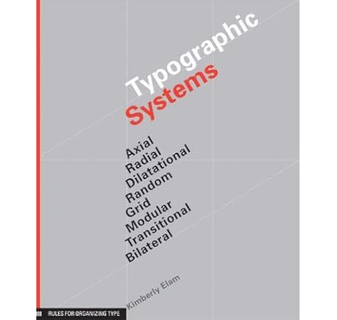
Fig 1.1, further reading
This book is written by Kimberly Elam. Typographic system has always been a complex system because there are many elements at work such as hierarchy, reading order, legibility and contrast. In this authoritative book, Kimberly Elam explores major structural frameworks beyond the grid, including random, modular, radial and bilateral systems. Each system is explained and explored to give you a better understanding of these intricate, complex arrangements. This will help you to fluidly organize your text and images within a structure combination of structures or a variation of a structure.
7 essential typographic layouts system

Fig 1.2, further reading
Seven essential typographic layout systems is written by Lucas Czarnecki.
Radial : when comes to radial, we probably thinking of something round such as sun. To create a radial design, pick a central focal point and place all the content so that it radiates out from that point. We usually start with content and medium and then adjust the inner edge and outer edge.
Grid : A grid layout needs some preparation and heavy does of discipline. With a grid, all the text and graphics fit neatly into columns and rows. This system works well on posters, books, essays, websites, cards, resumes and pretty much anything. Grid composition always start with the text and the composition size. Try to start with sketching a rectangle that is 1:1 with your composition size.
Transitional : for me, transitional is disorganize and it is not recommended for most projects. But, for posters and book covers, it definitely work. Creating a transitional system starts by hand, layout the strcuture , draw thin "sediment" in whatever form you like. Apply movement, try to implying some movement in your composition. Thus, direction. It can de line-up, straight or diagonal.
You can make your modules out of pretty much anything, Any shape, any layout, anything, They are mini compositions that come together to make a larger composition.
Thinking with type

Fig 1.3, further reading
The page is full of fascinating full colour examples, fast and easy to read. Moreover, it is packed with footnotes, side notes, quotation marks and other interesting tidbits, attracting readers and texts. It is written for more of a general audience that includes writers and editors rather than just designers. The focus isn't on the web as much; it's just more of an-around typography primer. This book include tons of tips about how to apply the practices through modern computer software. Some of the software tips are general statements, but a lof of them are focused directly at Adobe InDesign. The range of reference images in this book is thoroughly impressive including everyone from Gutenberg to Paula Scher. All of the extra information and examples are organized into a nice heirarchy and complemented well by text set in Scala (by Martin Majoor).
Comments
Post a Comment